When you enroll in this course, you'll also be enrolled in this Specialization.
Learn new concepts from industry experts
Gain a foundational understanding of a subject or tool
Develop job-relevant skills with hands-on projects
Earn a shareable career certificate
There are 3 modules in this course
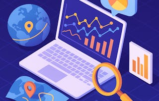
This course starts with turning data into clear geographic stories that help people see where patterns are happening. In this short, hands-on course, you’ll learn how to move beyond static charts by building an interactive COVID-case choropleth map using Folium. You’ll explore how geographic boundaries and data values work together to reveal regional trends, and how design choices like color scales influence interpretation.
As you progress, you’ll enhance your map with layer controls and informative popups that allow viewers to explore the data, toggle views, and access details directly on the map. Finally, you’ll complete the workflow by exporting your map as an HTML file and publishing it with GitHub Pages, creating a shareable link that works in any browser. Through guided videos, focused readings, and practical activities, you’ll practice moving from raw data to an interactive, web-based map that supports clear communication and informed discussion.
You are introduced to Folium and explore how choropleth maps communicate geographic patterns in data. Using COVID case data, learners build their first interactive choropleth map and understand how data values are translated into visual gradients.
What's included
2 videos1 reading1 assignment
Show info about module content
2 videos•Total 11 minutes
Introduction and Welcome•3 minutes
Screencast: Building a Choropleth Map with Folium •8 minutes
1 reading•Total 7 minutes
Understanding Choropleth Maps•7 minutes
1 assignment•Total 15 minutes
Hands-On Learning: Create a COVID-19 Choropleth Map•15 minutes
Enhancing Interactivity with Layers and Popups
Module 2•1 hour to complete
Module details
You will learn to enhance your maps by adding interactive features that allow users to explore data dynamically. This module focuses on usability, clarity, and stakeholder-friendly design.
What's included
1 video1 reading1 assignment
Show info about module content
1 video•Total 6 minutes
Screencast: Adding Layer Controls and Popups in Folium •6 minutes
Hands-On Learning: Add Layer Controls and Popups for Exploration•15 minutes
Publishing and Sharing Maps Online
Module 3•1 hour to complete
Module details
This module completes the workflow by moving maps from a local environment to the web. You will publish your interactive maps online so they can be shared with non-technical audiences.
What's included
2 videos1 reading2 assignments
Show info about module content
2 videos•Total 12 minutes
Screencast: Publishing a Folium Map to GitHub Pages•10 minutes
Advancing through Continuous Learning •3 minutes
1 reading•Total 8 minutes
Folium Maps to Shareable Web Pages: Publishing Static Sites with GitHub Pages•8 minutes
2 assignments•Total 35 minutes
Hands-On Learning: Publish Your Folium Map to GitHub Pages•15 minutes
Graded Assessment: Publishing and Sharing Interactive Maps Online•20 minutes
Earn a career certificate
Add this credential to your LinkedIn profile, resume, or CV. Share it on social media and in your performance review.
Coursera brings together a diverse network of subject matter experts who have demonstrated their expertise through professional industry experience or strong academic backgrounds. These instructors design and teach courses that make practical, career-relevant skills accessible to learners worldwide.
Interactive mapping here means building maps that connect data to geographic boundaries and let viewers explore patterns directly in a browser. The course emphasizes maps that are clear, accurate, and easy to interpret, not just visually appealing.
When would you use this kind of interactive mapping?
You would use it when location-based patterns matter and a fixed visual is not enough for people to examine the details. In this course, interactive mapping is used to help readers compare regions, inspect values, and understand how design choices affect interpretation.
How does interactive mapping fit into a broader workflow?
It sits between preparing geographic data and sharing findings, turning checked data into something people can explore for themselves. The course presents it as a connected workflow that moves from validated inputs to a usable web-based map.
How is interactive mapping different from a static map?
A static map gives one fixed view, while interactive mapping lets users click, toggle, and inspect more detail as needed. In this course, that difference matters because the map is designed to support exploration as well as quick visual understanding.
Do you need any prerequisites before learning to build interactive maps?
A deep geospatial background is not the focus here, since the course is beginner level and walks through the process step by step. What helps most is being comfortable following basic Python work and checking that data matches the correct regions.
What tools, platforms, or methods are used in this course?
The course centers on Python and Folium for building browser-based maps from geographic data. It focuses on choropleth mapping and on adding user-facing interactivity through popups and layer controls.
What specific tasks will you practice or complete in this course?
You will practice preparing geographic data, matching values to boundaries, building a choropleth layer, and refining color and legend choices for readability. You will also add popups and toggles for exploration, then export the result as a standalone web map that can be opened in a browser.